From easy-open lids to magnetic button shirts: 10 examples of inclusive design
Cooper Neill // Getty Images for Liberty Mutual Insurance
From easy-open lids to magnetic button shirts: 10 examples of inclusive design
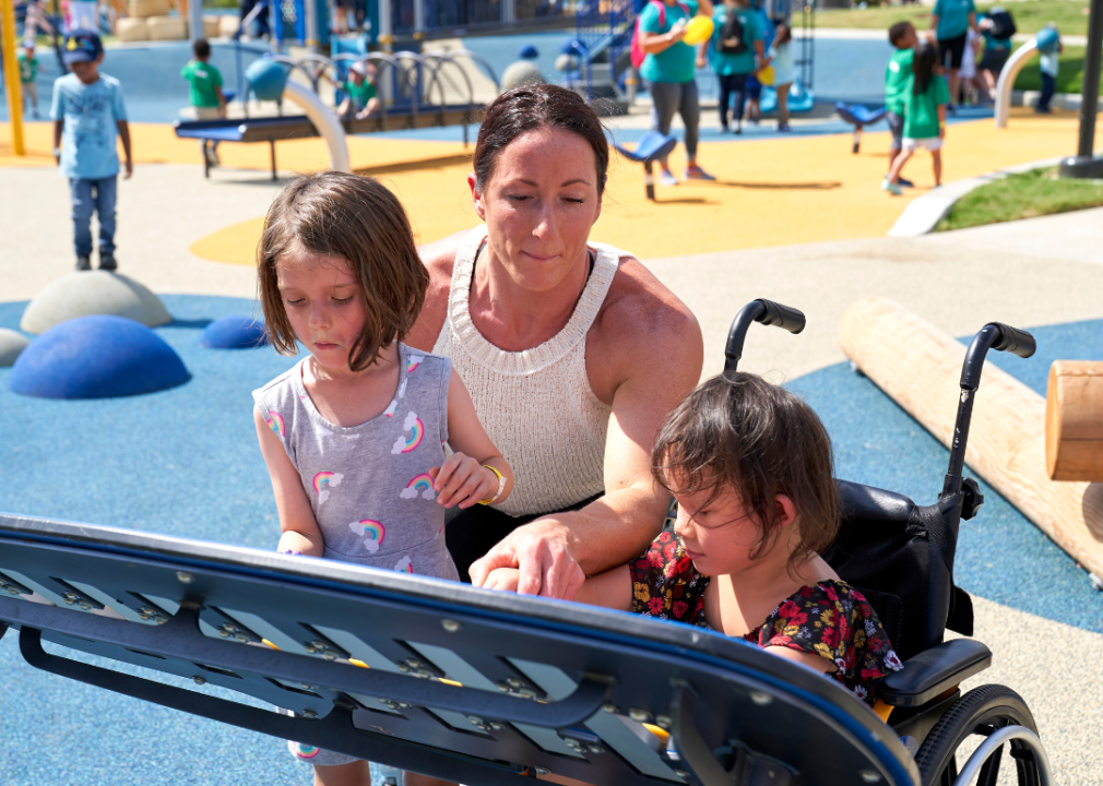
Woman and children at a universally accessible playground
In everyday life, we’re surrounded by items and facilities that people have designed for us. While many of these things and places are suitable for able-bodied, neurotypical people, others may not find it so easy to use the same grocery store shelves, public parks, or lace-up sneakers. This is where universal or inclusive design comes into play. In this field, designers seek to include as many users as possible by making small changes that affect the accessibility of items or places.
Foothold Technology, a provider of human services software, examined some examples of inclusive design found in everyday life created for people of all backgrounds and body types. From the public beaches of Vancouver to the cereal aisle, these designs seek to close the inequality gap that was created when previous designs did not consider all potential users.
Even if you’re able-bodied and neurotypical, you may realize some of the products on this list would be useful for you—wouldn’t it be nice if certain things were easier to open even with one hand, or if there were a stable path to walk on the beach? Accessible design can make life easier for almost everyone by removing bottlenecks in the design of everyday items.
![]()
mavo // Shutterstock
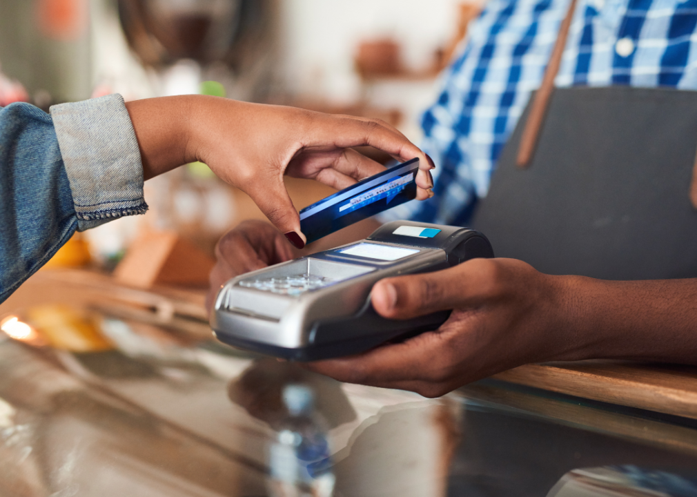
Credit card designed with different shapes
Customer using credit card
In the past, it was easy to tell which way to insert a credit card because of the raised text on the surface. Newer cards don’t have this feature anymore, and cards with chips may have different orientations.
In October 2021, Mastercard introduced a new feature where its cards have differently shaped notches on the side so users can tell which card they’re using and which way to insert it by touch. Maybe one day, the U.S. will also have paper money with different colors or shapes so low-vision users can tell them apart, an approach taken by many other countries.
Dusan Petkovic // Shutterstock
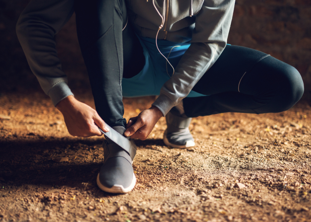
Easy on-off and single-only shoes
Person putting on velcro sneakers
Whether you work on your feet all day or you’re one of the majority of people whose feet are slightly different sizes, footwear can be a challenge for many. For those with various disabilities, even putting on or taking off shoes can be difficult—one that isn’t solved by having a full wardrobe of only clogs or sandals.
Today, “easy on-and-off” shoes are a whole category available from many major shoe brands, addressing the need for full shoes like sneakers that are designed to bend open and self-close when the feet step down. Brands also make lines with just one shoe, or a pair made of any two different sizes users need.
ezhenaphoto // Shutterstock
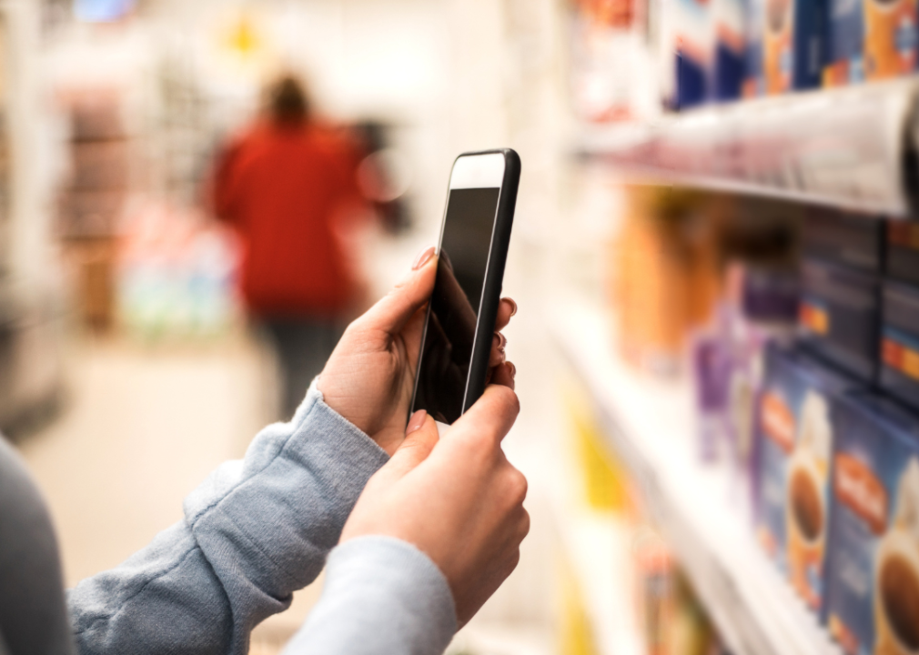
Cereal boxes with playback information
Woman using smartphone in grocery store
In a pilot program announced in August 2021, Kellogg’s is trying a new kind of cereal box printed with a special code to help customers with vision impairments to understand allergen information.
Food is ubiquitous—eating safely is the lowest possible level of Maslow’s hierarchy of needs. Between food allergies, medical intolerances, and conditions like diabetes, many people need to make sure what they’re buying is safe to eat. With a high-contrast black-and-white code that’s smartphone readable from up to 3 meters away, the new Kellogg’s boxes should help blind customers choose safe products.
shurkin_son // Shutterstock
Easy-open product lids
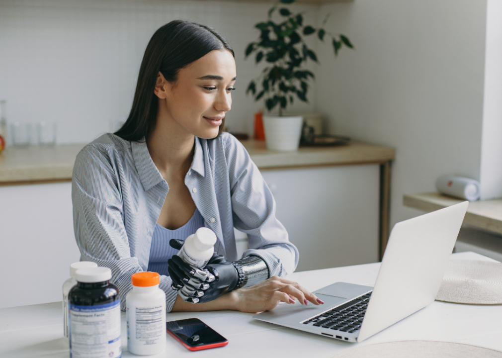
Woman with prosthetic hand holding bottles while on laptop
Skin care brand Olay is leading the way by offering a line of products released in November 2021 that have easy-open lids made with wide plastic wings. There are many conditions that can make it too difficult to securely grip and open beauty products and medicines. You may have also seen pill bottles with a plastic plate sticking up from the lid to make it easier to grip.
sportpoint // Shutterstock
Easy-grip deodorant
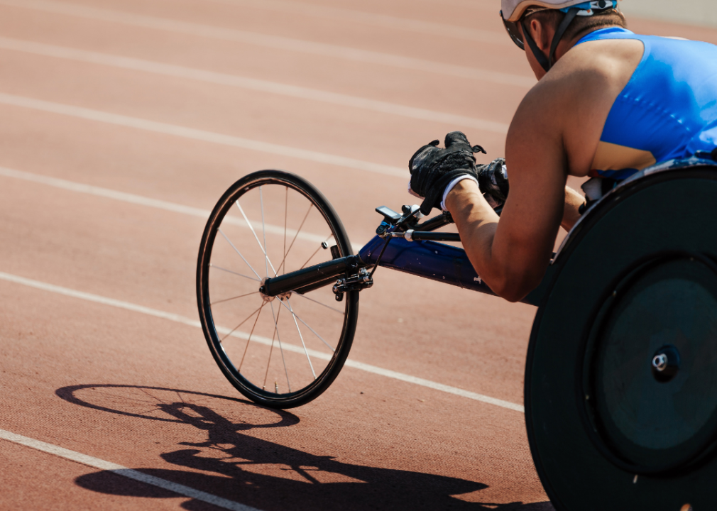
Wheelchair racer on track stadium
Deodorant is easy to take for granted, but the product is sneakily full of coordination and motor ability challenges upon further reflection. Almost every brand requires two hands. The cylinders are fairly narrow and difficult to grip without fine motor control.
In May 2021, Degree introduced new packaging designed to let customers avoid these design bottlenecks. There’s a wider base with indents for gripping, a hooked lid to allow easy hanging and removal, and a wider application area so you need fewer swipes.
Chansom Pantip // Shutterstock
Easier to read messaging apps
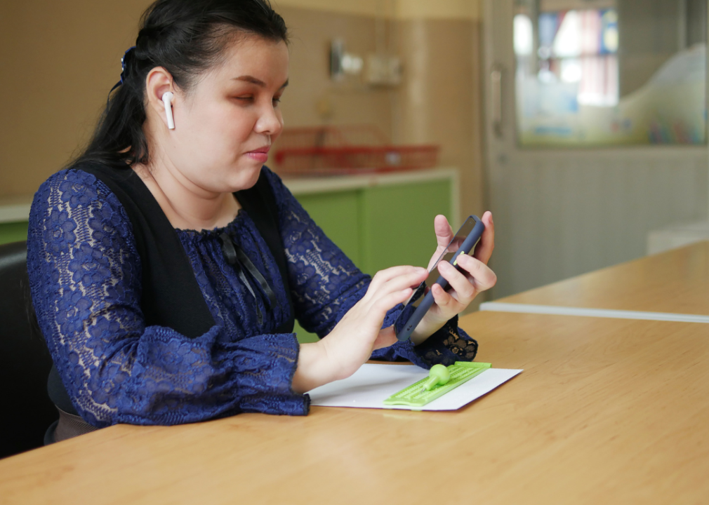
Blind woman with earbuds using smartphone
Keen-eyed observers over a certain age will remember when Windows 95 had a high contrast mode with large text and stark bold colors. Those same principles flow through to today: The internet has a whole set of accessibility guidelines for web design.
Makers of messaging apps used by company websites, for example—when a pop-up window invites you to chat with a representative—should follow these guidelines so the text is legible for all kinds of users, including those using screen readers. A screen reader is an assistive device that reads text and image descriptions on a website or app aloud. This may seem straightforward, but many sites and apps have code or special characters that can garble up the flow.
Drazen Zigic // Shutterstock
Smartphone display features
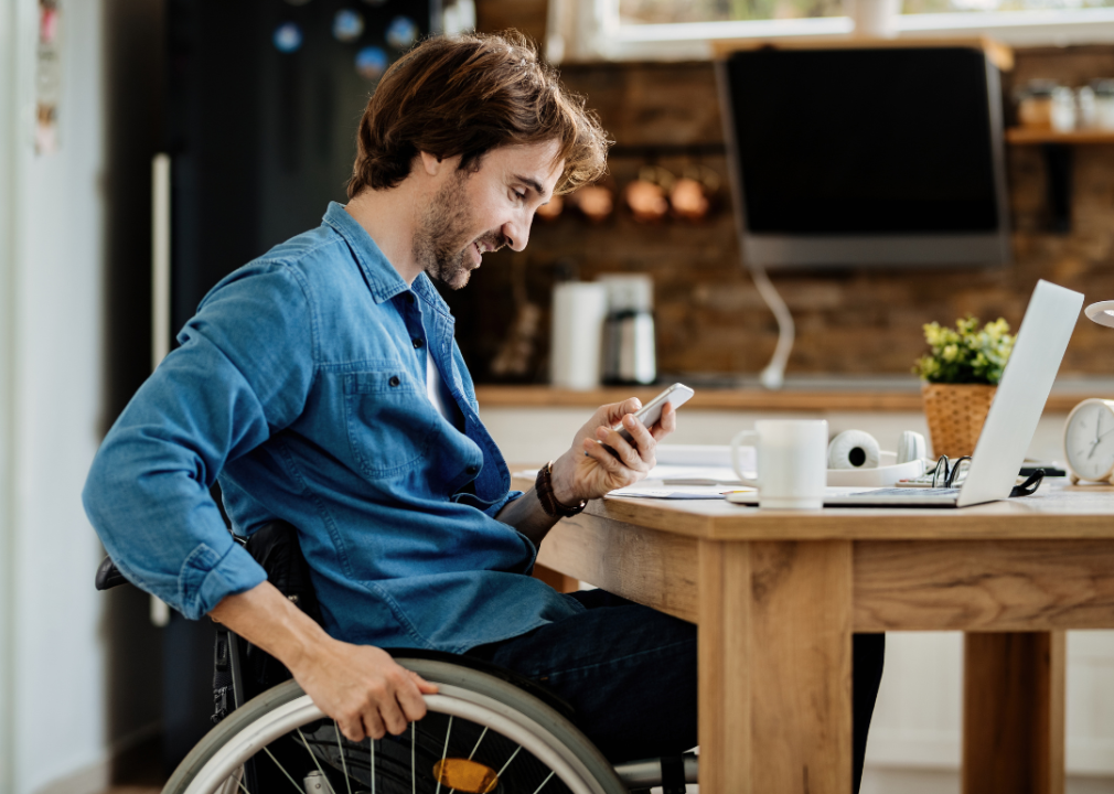
Entrepreneur in wheelchair reading message on smart phone
AARP has a great resource list for different smartphone accessibility settings. These include apps that turn everyday sounds and talking into live captioning for deaf or hard-of-hearing users as well as those with auditory processing issues.
You can also scale the text size up or down on your smartphone, though individual apps may not cooperate. One of the major breakthroughs for smartphone accessibility was just a general design principle. Website coders decided it made sense to query what size screen a user had, and serve up a mobile site with much larger text that scales to the narrower phone screen.
Marco Ciccolella // Shutterstock
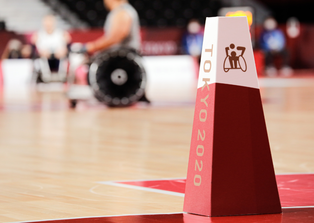
Updated signage for people with disabilities
Paralympic games wheelchair rugby sign
As an art project and public inspiration, Decathlon, the world’s largest sporting goods retailer, started updating the symbols of wheelchair users on their handicapped parking spots in November 2021. The new signs were inspired by the Canadian Paralympic team from 2020.
The signs show users engaged in sports like wheelchair rugby, where the culture surrounding the sport has significantly changed from or even surpassed the able-bodied version. Decathlon’s aim is to vary and diversify the image associated with wheelchair users to represent more experiences.
RacheeLynn // Shutterstock
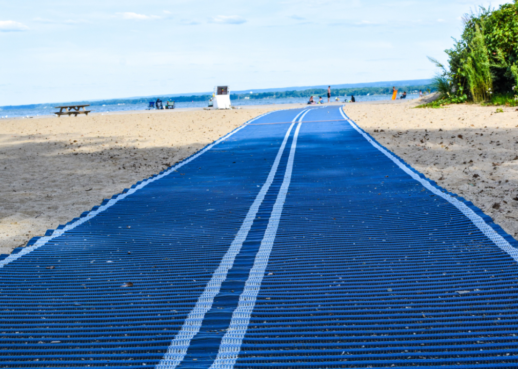
Surface design for outdoor public spaces
Mobility mat on beach
Parks are one of the biggest battlegrounds for people with disabilities: They’re designed for the larger public, but their setting in nature gives stubborn bureaucrats an excuse not to make accessibility changes.
Sometimes, existing facilities like walking paths have narrow gating that doesn’t allow for wheelchair access. Wheelchair users who visit beaches often can’t leave the path even to access the public restroom because it’s across a sandy stretch. Park designers are working to make parks more accessible with signage, pathways, structures, and more.
Mix Tape // Shutterstock
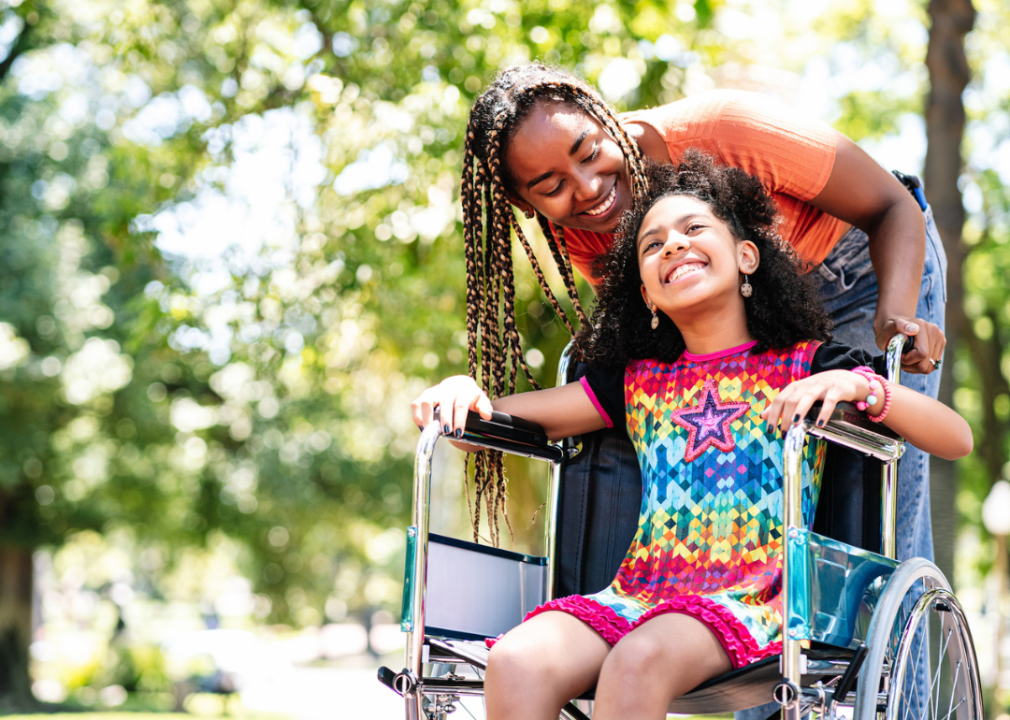
Adaptive clothing
Young girl in a wheelchair at the park with her mother
Adaptive clothing includes everything from tearaway clothing options to garments designed to be worn while seated. People with sensory issues may want clothing made of the softest materials, with special seams and without any tags.
In the sitcom “Speechless,” two moms of kids with disabilities started a business to make adaptive clothing after realizing their children were far from the only ones. Now, large companies like Target and Zappos are getting into the market. Brands that offer these products can secure lifelong customers by making small changes to their lines.
This story originally appeared on Foothold Technology and was produced and
distributed in partnership with Stacker Studio.